
Google Search Rolls Out a New Look
You may have noticed the Google results looking a little differently lately, and this is all down to the new search redesign update that Google rolled out towards the end of May.
This new update is intended to make the search results more concise and easier to read while making it easier to determine which results are the most relevant and helpful to you.
For the world of advertising this means that Google text ads have a fresh new look as well.
Let’s take a look at the differences.
Google Search Changes
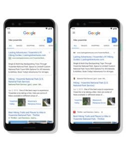
As we can see one of the main differences is the ad label and the display URL which are now both located at the very top of the ad and the colour has changed from green to black. This is the first time that the label and display URL have appeared above the ad headline.
Another key difference is that the ad headline and description are no longer divided by a grey line, making it easier to see the defined tiles of each search result.
Google states that these design changes are to help anchor each result and quickly identify where the information is coming from. During their testing the majority of users found it easier to identify a website and more than 60% said they found it easier and quicker to scan search results!
For organic search results, the main difference and new feature is the implementation of a favicon next to their results. Displaying a brand logo next to these results is once again part of the focus of being able to quickly and easily identify where the search results are coming from.
These changes are currently live on mobile but will be rolled out to more devices over the next few days.